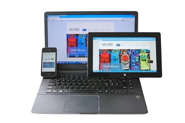
As we already know from our previous article on the reasons for high bounce rates on websites, more than 60% of users visit websites using smartphones. Business owners who use Google Analytics have already noticed that the lion’s share of their traffic comes from mobile devices. Therefore, there is no need to explain the importance of high-quality technical optimization of a website for gadgets. Adaptive and mobile versions exist for the convenience of using the website from mobile devices. If you are currently planning to develop a website or online store, we recommend discussing this point with your developers right away.
Responsive website layout, responsive design
Responsive layout is a way of displaying a website on smartphones that does not require a new version of the web resource. The purpose of responsive layout is to adapt the design to mobile devices (to the required screen size and orientation), which contributes to correct display. Of course, first and foremost, this is an additional advantage: for your users, it is convenient to use from any device, and for you, you don’t lose customers and increase traffic. Yes, you increase traffic because having a correct responsive version of the site adds “points” from search engines, so such sites are better ranked and therefore have more traffic.
Features of responsive layout and advantages:
- One URL for the website (does not take extra time to maintain the code, does not inconvenience visitors who have to remember several website addresses);
- Easy to view (even if the website contains a lot of different information);
- Does not require a lot of work on the website, which saves you time on website optimization;
- Comfortable navigation;
- Analysis and statistics are conducted from the same source;
- Traffic is directed to one website (prevents competition between websites and does not require additional redirects or more in-depth work by an SEO specialist);
Mobile version of the website
The mobile version is a separate, independent version of your website. It is simplified from the main version and created specifically for mobile devices. It has a separate URL (usually indicated by “m” or “mobile”). If you have a separate mobile version of your website, it further promotes your company. After all, you develop and improve everything for the sake of your users.
Features and advantages of the mobile version of the website:
- faster loading, since the mobile version, unlike the adaptive version of the website, is a simpler version of the desktop version of the web resource due to reduced functionality and simplified design;
- convenient for visitors to use (easy search across all sections of the site);
- Independent development. This point can be both an advantage and a disadvantage of this option, since, on the one hand, when changing the functionality or design of the desktop version, there is no need to worry about the mobile display, as these are two different systems. On the other hand, developing a website with a separate mobile version is significantly more expensive than the adaptive option.
- Version selection button for the user – if desired, it will switch to the full version;
Let’s compare the mobile version of the site with adaptive layout in terms of SEO
Let’s look at a few examples of the relationship between adaptive layout and the mobile version in terms of SEO:
Adaptive design
Due to blocks that are irrelevant to mobile users, it does not allow them to quickly find the information they need.
Mobile version
Targeted at mobile users; improves user experience.
Speed
For responsive design: the site is loaded by downloading html/css from the regular version, which slows down the site and makes it work slower.
For the mobile version: due to reduced functionality, there is less load and the site works faster.
Making changes to the project
For adaptive layout: linked to the site (one code), more difficult to make changes.
For the mobile version: does not affect the main site code, easier to optimize.
When using adaptive layout, promotion efforts are focused on a single domain, which is much better for SEO. But it all depends on the website we are starting from. There are cases when it is easier to make a mobile version than an adaptive one.
Conclusion
To sum up in simple terms:
The mobile version of the site is a separate version of your project, with separate program code but a single database.
The adaptive version of the site is a layout mechanism in which the site adapts to the size of the user’s screen and display. That is, it is the same project but with certain conditions for display at different screen resolutions.
In conclusion, if we are discussing the topic, “What will be better for my website?” Let’s say that in most cases, larger companies (willing to allocate funds and time) create mobile versions, while responsive layout is used as a more profitable option for small websites (a less expensive and faster option). In percentage terms, the vast majority of websites use responsive layout. When professionally implemented for medium and small projects, responsive layout is practically on par with mobile versions.